You may not think much about aspect ratios of media. But you might when an H5P image hotspot ends up being ginormous in your Pressbook.
Prepare for a wee bit of math, not much. Aspect ratio is the proportion of longest to shortest dimension of a geometric shape. For images, for the screens we use so much, it’s more or less the ratio of the width to height.
It’s why old school video (done in 4:3) aspect ratio gets those black bars in modern video screens, which are usually 16:9. Or it’s those weird nomenclature of video quality- what really is “1080p”? it’s merely video in dimensions of 1920 px wide and 1080 px high.
So what?
Here is where it comes into play in our H5P work. The content created is done so in a “responsive” manner- it resizes to fit the available width of various screens. This makes your content scale from small mobile size to mammoth wall mounted monitors.
But the way it works is by width- so media first scales so it’s width fits what the screen provides, and then the height just follows along for the ride.
And since most screens are wider than tall, content that is more or less wider than tall, scales well, like, say most photographs in
“landscape” orientation.

Okay, again, you ask, what does all this have to do with H5P?
This came up in a question in our Mattermost community from a project using the Image Hotspot content type.
I have a couple of image hotspots and the images in the textbook require scrolling. Is there a way that I can make the picture smaller in H5P so that it can all appear on the screen at once? I know they can click on it to make it pop out, but the rest of the team would like it smaller in the textbook.
I looked at the item being referred to, and it was a diagram that was the opposite orientation, it was very tall and not wide. So what happens is, it gets stretched to fill the width, and the height then grows very long vertically on the page.
I first tried some dabbling to see if there was a way with custom CSS to make the H5P content not was wide. I could get the frame to be narrow, but the interior content would not resize, it was truncated. There may very well likely be some advance method, but when you are trying to change the display widths of content embedded via iframes (jargon alert), it gets very iffy if it will work in all cases.
So I tried a different approach- re-edit the original image so there is a lot of “padding” (blank) space on the sides, so it remains a vertical image for the content, but is sized more wide.
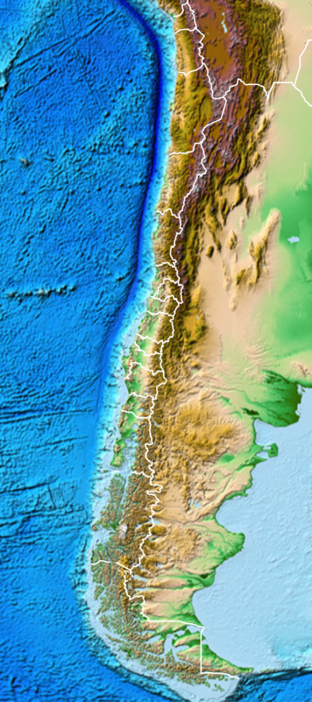
Enough talk, let’s try an example. Something that is maybe more tall than wide, how about a map of Chile?

And maybe my hotspots would be some locations of volcanic landforms.
When I upload this image into the image hotspot tool, add a few points, and publish, well it will occupy a lot of vertical space on a page. It calls for a lot of scrolling up and down.
This is because, again, it is filling the space with the image’s width, and the height gets stretched the same amount.
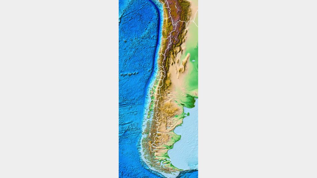
To fix this, I make a new version of the image, where it is full height (I scaled the height to 1080px), but I make the canvas (background) 1920px wide, and fill with the color #eeeeee (because that is the same color as the H5P frame).
This is the new image:

Check this out! I made a copy of the same HotSpot content type, and swapped out the image for this wiiiiiiiiide version. It makes a big/small difference.
I can resize the scale of this without any coding, just by placing a tall image in a wide frame.
This is really going to be a consideration only when you are dealing with images that are much taller than wide.
It’s all about aspect, width to height. See, geometry can be your friend.
Image Credit: Pixabay Image by stevepb


3 Comments
Hi!
H5P always scales content to the full width that the iframe is given and then adjusts the height according to the original aspect ratio.
The easiest way (yes, I know that easy is relative) to set a maximum width without changing the content is to wrap the H5P iframe in a div container and to give that one a specific width.
Hope this code snippet gets encoded correctly here in the comment field:
<div style="width: 300px;">H5P iframe or shortcode in here</div>
Cheers,
Oliver
Thanks Oliver, that makes sense. I will give it a try, although I would not suggest defining a fixed with; maybe a percentage width and min/max width style. I appreciate the info. I just want folks to keep these things in mind as they pick the media to use in H5P (like getting the right aspect ratio to use in the Presentation Content type so it fits as a background image).
Sure! A relative width often makes more sense.