When I say “Accordion” your first association may be the musical instrument. But here we are talking about a simple, display-oriented (no built in feedback) H5P content type that has potential use in Pressbooks.
In the project work so far, we have seen use of these for end of chapter review of terminology, but also as a quick knowledge check where a question is presented in a form where the reader is asked to think about their response for toggling open an explanation.
Accordions can have a place in creating practice activities, often in the context of other content, text or H5P. They are like drawers of content that can be opened and closed.
One issue that might come up is in the exported versions of Pressbooks content, as H5P are not rendered but replaced with a link to view them online. So the accordion music goes silent in non web-based version.
Also note that the H5P Accordion can display formatted text plus lists, quotes, but no media. e.g. images.
There is an alternative that uses standard HTML tags that are also accessible and can appear in exports. Meet the use of the <details> disclosure tags playing here the part of an Accordion.
What Are Accordions For?(show/hide)
The H5P documentation spells it out nicely:Reduce the amount of text presented to readers by using this responsive accordion. Readers decide which headlines to take a closer look at by expanding the title. Excellent for providing an overview with optional in-depth explanations.You can see that this might be effective to reduce long lists of information, references, or breaking content into sections more like a miniature outline. Or even to present a question for a learner to consider before revealing a suggested response. In this case, an Accordion is used just demonstrate itself.
Foot Stomping Music(show/hide)
Well, that was silly. It would be useful maybe if one could include images here, but alas not in H5P. But we can here!
Something Extra Sneaky!(show/hide)
Were you expecting that? Have we reached some form of H5P Inception?
This all came about from a request for something different.
Several responses later, Steel Wagstaff (our friendly Pressbooks connection) chimed in with this suggestion.
I thought I knew much about HTML but this structure was brand new to me!
It does require that you flip your Pressbooks editor to the HTML mode, and enter content between a tag structure like this (see more information about the HTML tags):
<details>
    <summary>Title that appears on screen</summary>
    This is everything that appears when the accordion/disclosure is opened.
</details>
It’s not without issues. The appearance is not quite the same in different browsers. For Chrome and Safari, you automatically get a side pointing triangle for the summary text that turns downward when the drawer is open. This does not appear in Firefox (and perhaps other browsers). Also, the summary is technically a clickable object, but the cursor remains a cross hair when positioned over it. Both parts look not all that different from the body text, except for a highlight box around the summary tags
My examples here have made use of custom CSS to change background colors, change the cursor for summary to a pointer, and a little trick to format anything inside the <em>…</em> tags within a summary (e.g. “show/hide”) to be right aligned and smaller font.
details {
  background: #eee;
  margin-bottom: 2rem;
  padding: .5rem 1rem;
}

summary {
  cursor: pointer;
}

summary > * {
  display: inline;
}

summary em {
    font-size: 80%;
    float: right;
}
These styles could be modified if they do not work for you. This is where the styles listed above can be inserted.
- Pressbooks: Go to Appearance -> Custom Styles and paste the CSS styles into the space for “Web Styles”
- WordPress: Go to Customize -> Custom CSS and paste in the CSS styles
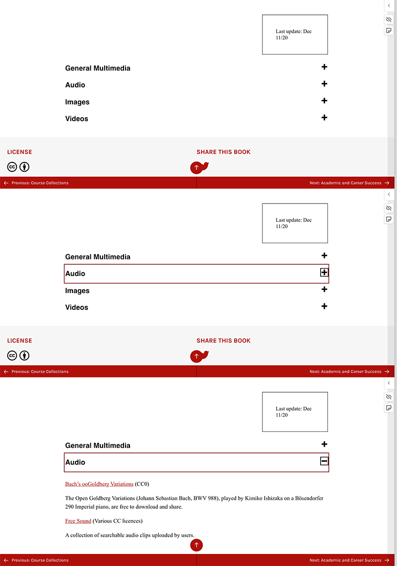
I have seen other approaches. For example in the OER By Discipline textbook section on sources for open media, long lists of content are nicely collapsed, shown here in a 3 screen animated GIF. The plus sign indicates something to open, and the minus sign to close again.
For a detailed treatment of not only how to create these but also a thorough treatment of how it meets accessibility, see Collapsible Sections from the Inclusive Components site.
Using this method involved much more complex raw HTML editing and use of SVG tags, but we present it just to provide one more approach. It also might require use of an extra bit of Javascript code that most Pressbooks authors will not have access to install.
This is maybe a lot of detail for a simple thing to flip content drawers open and close, but we want our H5P kitchen visitors to know what’s in the cabinet and some consideration for choosing between approaches. We also would love to learn of more creative ways to use simple H5P content types like the Accordion. It’s often not just within the tool itself, but as we saw in the Vital Signs project, how different tools can be pieced together or how the context around the H5P can generate some deeply interactive Pressbooks dining experiences.
What might you use these for?
Image Credit: Unsplash photo by Maksym Kaharlytskyi


3 Comments
A precursor of the future: There’s a pull request at https://github.com/h5p/h5p-accordion/pull/41 that allows Accordion to not only use text, but any H5P content type that is supported by H5P.Column (except Accordion itself).
Ah that will be very useful! Thanks Oliver.